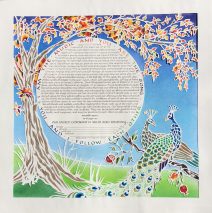
Peacock Pair in the Pomegranate Tree Ketubah
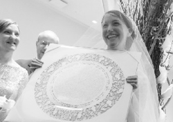
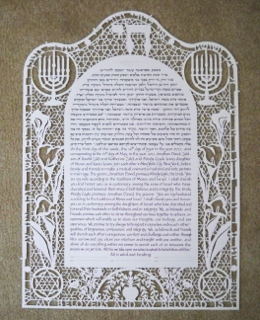
There was magic afoot when I was able to share the tradition of the goldene pave (the golden peacock), as a symbol of Yiddish culture after learning how deeply connected the bride felt to her own tradition’s veneration of the beauty of the same bird. The three of us worked closely on every aspect of the papercut design you see above in order to bring their desire for a vivid setting of their words to life. Tucked into the center of the document is the Sanskrit, translated into English and circling the...
Read MoreWhere There is Love Marriage Document
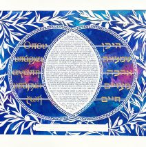
A marriage that honors the traditions of Judaism and Greek culture led this couple to incorporate both Greek and Hebrew in the design of this elaborate papercut document. The line, “Where there is love, there is life” appears in the text and has been pulled out to create the design on either side of the text lozenge. Surrounded by papercut olive branches and a traditional key pattern, the text is centered and floats above a painted background that simulates deep space and the imagery with which we have become familiar by way of the Hubble satellite and others. Color was most important to the bride and groom, and touches of gold sparkle through the piece. The entire work is cut from one sheet of white paper with the Greek and Hebrew words painted gold on the...
Read MoreDelicate Seasons Papercut Ketubah
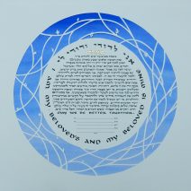
The simplicity of this ketubah belies the complexity of the couples’ intentions and the work involved in bringing their vision to life. We began with a request for leafy images of the turning of the season and a very simple papercut design. After many sketches sent back and forth, we hit upon a design that nests the text in a pattern of abstracted twigs. The seasons are referenced in tiny buds, opening blossoms, new leaves, and finally aging and falling leaves – only a few for each season. It’s worth the effort to spot the seasons this way! The background color took 5 different tubes of paint to mix in order to match the periwinkle blue paint chip that the couple chose. The background was painted on a stretched sheet of watercolor paper and then the text and papercut image were dropped on top to allow the cut paper to sit a bit...
Read MorePapercut Orchestra Ketubah
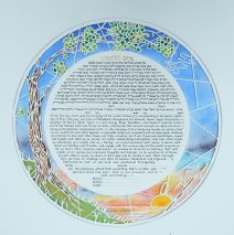
As always, the drawing table is clear when I start work on a ketubah and I am wide open to a new adventure! This couple met while playing in an orchestra, he the horn, and she the bassoon, and along with the papercut images and the sunrise on the sea, they wanted the instruments somewhat hidden in the design. The French horn (based on a photo of his magnificent instrument from an earlier era) was the easiest since it lent itself to becoming the rising sun. The bassoon took some tweaking, at first very recognizable with all the stops and valves, and then stripped down a bit and nestled in among some sea grasses to keep it part of the bigger picture. Creating this piece involved lots of images sent back and forth to make sure the tree was just what the couple wanted. If you look closely you can see that the papercut is elevated just slightly from the pastel colored background so it creates a thin shadow effect. This way the delicacy of the papercut cannot be confused with a silk screened print. Here’s a look at the text and papercut before the color was...
Read MoreJali-influenced Papercut Award
The delicate art of Jali carvings from India informed the artwork I chose to accompany the text of this award. The delicate papercutting was done on brown paper and mounted on a sheet of white paper dusted with pale yellow pastel chalk, giving the piece a softly mottled look. When I create these awards, I request as much information about the recipient as I can get so the piece is a perfect...
Read MoreFrank Lloyd Wright’s Light Screens Ketubah
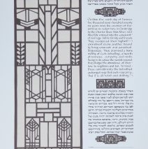
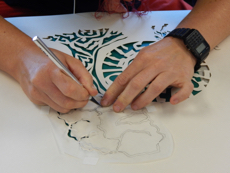
This piece took a wonderful couple and their artist-of-choice on a fabulous visual journey. From the very first email contact, when they sent me some inspirations in the form of Mogul Jali funerary architecture – which I had been drawn to that very day when I saw an example while on a trip in the Sinai desert – I knew we were ‘right for each other.’ My sketches, their photos, my library searches, and many more sketches flew around the globe because the last 3 weeks before the piece was due found them working in a tiny Malaysian village where wifi was hit or miss, and where we had to plan for contact while everyone was awake! Truly an adventure. I learned so much more than I’d ever known about the craftsmanship of Frank Lloyd Wright as I sought out records of his glass work. I extracted small bits and pieces of a wide array of the master’s designs, and silently requested his forgiveness for messing with his ideas! Another touch was the inclusion of a repeating design from a window by Eliel Saarinen, chosen specifically by the bride and groom. When it was time to assemble the work, I carefully cut away the areas behind which the brown papercuts would be seated. This was quite a challenge for the three small designs that break up the sections of text since there had to be enough white paper for glue, but it had to be cut back far enough to be invisible to the observer! I had a framer mount fine wheat-colored linen on a board and then we mounted the text with papercuts on that to allow the subtle warp and woof of the fabric to echo the horizontals and verticals of the cut paper. The papercutting itself was done freehand with no metal rule. Each time I had to cut a long line, I took a deep breath and let it out s-l-o-w and controlled as I drew the knife through the paper. X-acto Z blades, a new product – WAY very sharp and strong – are the blades of choice. I buy them in boxes of 100 and don’t hesitate to swap them out if I feel there’s any loss of...
Read More
