Torah Wimple – The River out of Eden
Posted by Susan on May 5, 2016 in Jewish Ritual Art, News, Visual Art | 0 comments
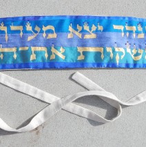
This Torah Wimple (binder) was commissioned as a gift from a rabbinic school class to the chapel at the school upon ordination. The passage from the book of Genesis, transliterated as “V’nahar yotzei meyeyden l’hashkot et hagan,” means “And a river went out of Eden to water the garden.” The wimple is crafted of colorful silks, quilted and embellished, with a backing and ties designed for ease of function and to grip the klaf (parchment) without sliding down, because, after all, this is a piece of ritual art which must do its job! The text is created with textile paint, and further embellished with Swarovski crystals in the place of the tiny tagin (crowns) that appear in the Torah text. Torah...
Read MoreSycamore through the Seasons Quaker Document
Posted by Susan on Feb 11, 2016 in Ketubah Art, News, Visual Art | 0 comments
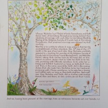
One precious tradition in the Quaker community is to have all attendees at a wedding sign the marriage document as witnesses, so the design is begun with that in mind. The lines for witness signatures continue far below what’s seen here, and upon completion, I’ll take the document back and erase the very light lines. Here the couple chose to work with the image of the sycamore tree in its four seasons arching over the text with the lines for witnesses (who will sign in brown ink) below, implying the roots and support for the marriage. The text is nested within nature images, the wildflowers at the base of the tree echoing the seasonal changes in the tree’s crown....
Read MorePapercut Ring Marriage Document
Posted by Susan on Feb 11, 2016 in Ketubah Art, News, Papercuts, Visual Art | 0 comments
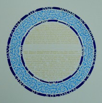
As always, surprises come my way when couples talk with me about their ‘wish list’ for a custom commission. In this case, the text includes Latin by Petrarch and Dante, and a lovely selection from the poetry of Christina Rossetti. The challenge of the poem was that in verse it breaks into many lines with lots of punctuation. Placing that in a format that more resembles prose and needs to keep the integrity of the poetry while showing line breaks was a challenge, so the solution was to cut the tiniest circles out of the paper and back them with a lighter paper to minimize the disruption that inserting more symbols would have caused. The Latin text is lettered in an authentic Rustic style that would have been seen in Latin scribal work at the time of the original writing. Calligraphic history and integrity! Note in the close ups below that the lettering is done in gold! This is a high quality (Schminke) gold gouache, a pasty water-based paint that may be thinned enough to flow through a pen. Oh, and the papercut? I used about a dozen X-acto blades on this. The tiny points break, and the friction when cutting heavy paper dulls the blades as well. I purchase my blades in bulk! Work in...
Read MorePersian Carpet Ketubah
Posted by Susan on Aug 30, 2015 in Ketubah Art, News, Visual Art | 0 comments
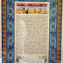
This ketubah was designed for a ‘mixed marriage’ – Ashkenazi and Sephardi! The text, written in square Ashkenazi lettering, is surrounded by design drawn from Persian tiles and manuscript art. EVERYTHING is drawn and hand-painted, using Japanese Sumi ink, watercolor and gouache. Above the text block is a painting of Jerusalem, and the Hebrew words – Ani l’dodi v’dodi li’ (I am my beloved’s and my beloved is mine.) Below the text, two peacocks, a reference to the Goldene Pave (the golden peacock, symbol of the persistence of Yiddish culture) flank the Yiddish translation of the same line from Song of...
Read MoreJerusalem/New York and Beyond Papercut Ketubah
Posted by Susan on Aug 10, 2015 in Ketubah Art, News, Papercuts, Visual Art | 0 comments
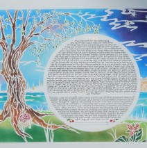
For this ketubah, the discussions led the couple to identify images that they wanted, as well as style. They brought to me a gnarled tree, a lake, references to New York City and Jerusalem, and also Traverse City, Michigan, home of the bride’s family and the site of the wedding. They were drawn to papercut art with soft ombre coloring behind. How to fit it all in? You see above! Jerusalem and NYC are easy, but Traverse City also takes a bow as the sour cherry capitol of the United States by way of a basket of cherries nestled at the base of the tree. And can you find the Yiddish word ‘bashert’ (fated or destined love) ‘carved’ into the tree...
Read MoreAbout Me
- ‘… I was deeply moved by the vision and scope of your historic research. You wove poetry, song and democracy into a beautiful tableau of remembrance…” – Myra Sacks
What’s Susan up to?
Penn State Center for Holocaust and Jewish Studies will host me as I present a solo program of song and history focusing on the roots of Eastern European Jewish music and related songs.

I have the honor of presenting this year at the annual American Folklore Society's conference. A lecture on papercut arts around the world and a demonstration of my own work will take place during the conference on October 22, 2021!
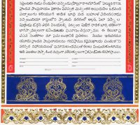
ELEVEN languages and counting! Over the years, I've crafted ketubot that honor many cultures. In addition to the expected Aramaic, modern Hebrew, English, and even Yiddish, I have included Korean, Kannada, Latin, Arabic, and even the Telugu seen in the cropped image above! What a joy this has been!
What a wonderful experience I shared with the community of Las Cruces, NM and the Guild of American Papercutters when I presented an hour-long lecture on the worldwide history of papercut arts on March 16, 2021. This was in conjunction with the museum's show of Islamic papercut art. We looked at tools, traditions, and especially shared visual vocabularies from India to Mexico, from Persia to China and beyond!
February 18, 2018 - Susan will be hosted by the Sholem Aleichem Center in the Bronx for a concert. Come for a shmuez (a chat) and stay for the music!https://www.pineclubgolf.com/best-electrical-push-carts/
As part of the Sacred: Image, Text, Ritual exhibit at Lebanon Valley College, Susan will be presenting a lecture recital titled "Words as Homeland: Where Jewish Text, Art, and Song Converge to Express a Culture." Thursday, February 8, 2018, 5 pm at the Zimmerman Recital Hall.
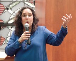
A wonderful arts residency in Teaneck, NJ at Congregation Beth Sholom concluded with a full concert, accompanied by Adrian Banner on Piano. Enthusiasm and learning flowed back and forth the entire time. Fabulous community!

What a great night at the Jalopy in Brooklyn on June 16, 2016 as my new trio with Lauren Brody and Jake Shulman-Ment stepped out to strut our stuff! Many languages, many musical cultures, and great joy in blending our voices and instruments.
____
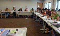
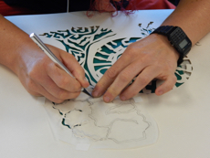
In the beautiful summer landscape of Rindge, New Hampshire, I was privileged to teach traditional Jewish papercut arts at the annual National Havurah Committee's Summer Institute. We turned a large, sunny room into an art studio, and the class burst into enthusiastic art creation. I love the celebratory greeting of everyone's creations as skills and appreciation deepen over four days of classes. I'll come to you! Just ask!
_____________________________
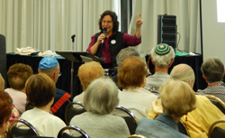
Back to the Catskills, this time teaching for HAZAK, a group under the umbrella of United Synagogue that offers among its programs an annual summer week of learning and camaraderie. I used my lecture/recital format to widen the world of Yiddish song for about 150 life-long learners as we studied, laughed, sang a bit, and grew to know one another in Kerhonkson, NY.
______________________
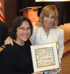
When Nancy Spielberg screened her film Above and Beyond in Harrisburg's Chisuk Emuna Congregation, I was tapped to create a papercut gift for her. I chose the color scheme of her promotional material and the Hebrew words which translate into "Be strong... and strengthen one another." The filmmaker and I are shown here. (photo by Josh Damrauer)
___________________
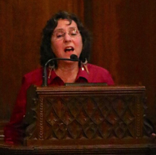
Each year the myriad of faith communities in the Harrisburg region come together to celebrate in song. Here's an image of my participation, sharing the beauty of Yiddish song at the Pine Street Presbyterian Church.
____________
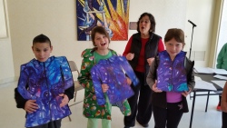
One of three children's programs to wind up a hectic and marvelous Scholar in Residence program at Congregation Beth El in Fairfield, CT. Lectures, singing programs, explorations of Yiddishkayt - and a debut concert of the new Leviton/Brody duo in concert! I'll happily come to your community, too!
______________________
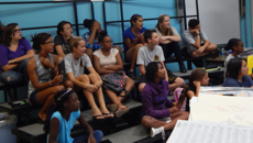
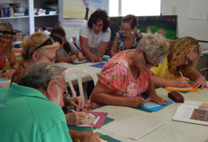
Yiddish Culture on St. Croix! I received the warmest welcome all across the island where I had the opportunities to teach a vocal arts class in a school, offer an adult papercutting workshop, lecture in the synagogue, and get the whole audience at the Reformed Church singing along in multiple languages! Cultural seeds planted and the smiles, voices, and hugs still linger in memory!
______________
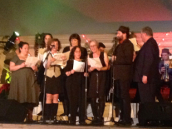
The Judson Church off Washington Square was packed with well over 300 people on December 30, 2014, to honor the memory and brilliance of Adrienne Cooper, and to award Michael Wex with this year's Dreaming in Yiddish prize. Below is an image of the finale of the musical performance of the Kanonen song from Brecht and Weill's Threepenny Opera, translated from the German into Yiddish by Wex himself. An all-star band backed us as we belted out the Army Song and others, accompanied by the brilliant puppetry and staging of Great Small Works and Power Point translations which made the text a little less inscrutable! What a night! Singers below include Sarah Gordon, Eleanor Reissa, Tine Kindermann, Dan Kahn, myself, and others.
______________________
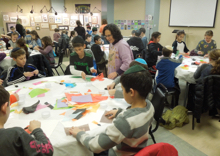
A whirlwind arts week in Caldwell, NJ at Congregation Agudath Israel allowed me to open Jewish folk arts to energetic groups from preschoolers through elders. The tots sang and acted out Yiddish songs with costumes and props, the school students (4 larger groups) explored paper arts and traditional papercutting, and adults were treated to a series of lecture recitals, everything taking place in a large space where I hung over 35 works of framed art. What a fabulous arts residency for all of us together!
_________
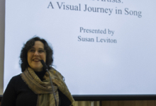
Nearly 100 people attended a lecture/recital stitching together I. B. Singer's writing and the artists who illustrated his books as Susan sang her way through the bookshelves, Sunday, November 16, at Chisuk Emuna Congregation in Harrisburg, PA. This was the second event in the year's programming under a grant from the Koster Foundation.
____________
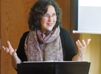
I was guest lecturer at Dickinson College today, October 6, singing my way through a program on Jews and Food. Unlike the light weight singalongs I often do on this topic, the class took food songs into the framework of Hasia Diner's examination of the place of food in Jewish life in the Pale of Settlement through acculturation in America. 15 songs unpacked! A great eye-opening experience for all!
________
Heeding God's Call is a national organization working at a grassroots level to end gun violence and straw buying. On September 18, within days of two gun murders in Harrisburg, I participated in an interfaith program at the MLK Baptist Church in the heart of our city. We 'sang' Reisen's Dos Naye Lid together as the assembled crowd held colored cards with words in Yiddish and English.

_____________
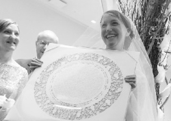
A happy bride at the huppah with her papercut ketubah! 'Tis the season, and I've been busy with commissions of all sorts!
___________
A full week of learning and teaching at the Havurah Summer Institute was a welcome experience again this year. Located at Franklin Pierce College in New Hampshire, about 300 Havurahniks from infancy to elder sage-age filled days and nights with enthusiastic work, food, music, and exploration. I taught classes in Yiddish song and helped create a soundscape for Tisha B'Av this summer. Loved it!!!

_____________
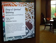
A lovely way to begin the summer's KlezKamp's Wisconsin adventure was a solo concert at Chai Point in Milwaukee. Jill Gellerman and were welcomed to the beautiful facility and then I sang for and with a great crowd of elders, eager to be part of the action!
____________
Quite a surprise when I met the truck from Welch Signage in Maine, carrying the massive synagogue feature wall I had designed, to see a piece of my own artwork prominently displayed on both sides of the vehicle!

___________
I performed for over 100 people at beautiful Maris Grove in Pennsylvania's Delaware County on May 13. As part of the PA Humanities Council's program of Commonwealth Speakers, I was able to bring the sound of Yiddish to an audience largely unfamiliar with the language and culture. As always, common threads were immediately found!
_____________
Verrry busy these days creating a synagogue feature wall, but I took time last week to be interviewed for Ted Merwin's article "The Aesthetics of Judaism" in The New York Jewish Week. Here's a quote: "For Susan Leviton, a ketubah-maker, paper-cut artist and Yiddish folk song performer ..., it was during the 1960s and ’70s, when many Jews flocked back to their roots, that Jews... 'took Judaism back into their own hands' and began braiding challahs and tie-dying prayer shawls. Hiddur mitzvah 'alters us as we fulfill a mitzvah or perform a ritual,' she told me. A Midrash (Song of Songs Rabbah 1.15) suggests that observance of the commandments makes Jews beautiful, even as Jews glorify God through hiddur mitzvot."
_________
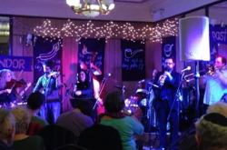
An outpouring of love and creativity filled the room as we honored the memory of Adrienne Cooper and saw Jenny Romaine accept the first Dreaming in Yiddish award for her visionary work. Here's Susan on stage with Alicia Svigals, Jake Shulman-Ment, Benjy Fox Rosen, Aaron Alexander, Michael Winograd, and Dan Blacksberg, 12/21/13. (Photo by Bob Blacksberg)

When Goucher College Hillel welcomed a gift of two Torah scrolls, I was honored to craft mantles and wimples. So much silk! Garnet polished to look like pomegranate seeds! Text and the visions of students to work with! A grand experience.
_____________________
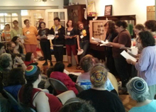
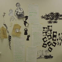
A totally spectacular group of artists, writers, social activists, and even puppeteers joined me for a week of creative work as I served as Artist in Residence at the 2013 National Havurah Conference Summer Institute in Rindge, NH. In 4 days of intense collective learning and creating, we built a musical theater production in a box (a cranky) and shared the story of the plight of needleworkers, past and present, with 300 others in a rapt audience!
____________
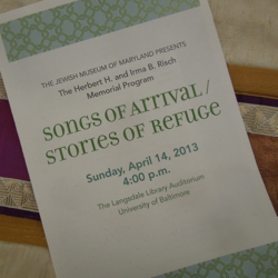
It was a beautiful day in Baltimore as the Jewish Museum of Maryland presented its annual Risch Memorial Program. I was delighted to be the featured performer, following brief, powerful presentations by Andres Salguero, Ssuuna, and the DC Turkish Folk Music Group. It always touches me to rediscover the points of connection among immigrant communities, regardless of geographic homes, cultures, and reasons for relocation. A brilliant celebration of cultures!
________
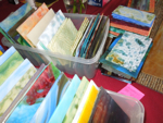
Over 350 pieces of beautiful Youghiogheny Art Glass hand-cut, and now I'm on to wet-grinding the edges! It's a new skill that I'm happy to add to my resume as I take on the responsibility to create a soaring double wall of glass above the Torah ark for Chisuk Emuna Congregation in Harrisburg, building anew after a destructive fire in 2009. Check back in mid-May for a look at the completed wall!
_________________
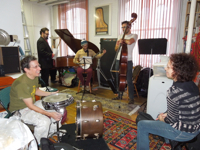
Getting closer to a new recording! Michael Winograd spent a day in the studio on March 28 with Frank London, Dan Blacksberg, Hadar Noiberg, and Alec Speigelman to lay down horn tracks for my as-yet-unnamed CD. Dan Kahn joined in as a special guest vocalist. Next will come strings and soon after that the mixing and mastering, printing and artwork, and OT AZOY! A new Yiddish recording!
__________________

A whirl of creative activity has sent me to the sewing machine to craft two Torah mantles for Goucher College Hillel. One of the scrolls is a rescued Torah from Czechoslovakia, so armed with a palette of palest greys, golds, silvers, and ivories, I headed to Chinatown in NYC on a rainy day to seek silks! What a delight to discover Belraf Fabrics, owned by an Uzbeki couple. A trip around the world in fabric! Take a peek here are the first days' construction.
___________________
I'll be guest lecturing at Dickinson College in Professor Ted Merwin's class during the week that we commemorate the 102nd anniversary of the Triangle Shirtwaist Fire. My program on the fire in words and Yiddish song continues to grow as I learn, and to sadly resonate as we all ponder how little has changed in global workplace safely in the last century. See "Upcoming Events" for details.
_________
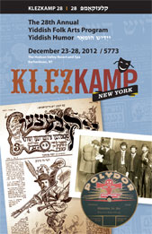
Each year as KlezKamp ends, I proclaim, "This was the best ever!" And every year I mean it. And this year I mean it more! The staff concert nearly lifted the roof off what had been, in its glory days The Granite Hotel in the Catskills. My classes (traditional papercutting and "Our Lives are in our Songs") were filled with curious, thoughtful participants who challenged one another to take each idea to a new level. What an experience. Do not miss this next December!! (sneak peek? Check out the KlezKamp post under Upcoming Events for a video clip!)
__________________

December 22, 2012. Kaye Theater in Manhattan. I soared on the energy of dozens of the finest performers of Yiddish song and Klezmer as we paid tribute to Adrienne Cooper's memory in a three-hour concert of the songs she most loved. What a thrill to sing 'Di Arbuzn' a cappella, in three parts with women performers including Alicia Svigals, Lauren Brody, Shura Lipovsky, and Marsha Gildin. It was both a humbling and energizing evening. Sing out!
_________
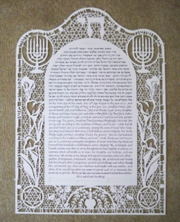
I've just been selected as one of ten 2013 Guild of American Papercutters/X-acto Masters. This means over the course of the coming year I will be testing tools and materials and interacting with other artists to hone our skills and increase interest in papercutting arts. Very exciting!
_______________

Are you aware of the Commonwealth Speakers program under the PA Humanities Commission? Every two years, a roster of artists, story-tellers, historians, and musicians selected by the PHC are able to travel the state offering specific programs at no cost to groups (schools, libraries, state parks, etc.!) other than a basic application fee. I just returned from Ohev Sholom in Williamsport and will head to Reading on Thursday to bring Women's Voices in Yiddish Song to the Federation's Friendship Circle there. Visit the website at www.pahumanities.org and check it out! Free programming! What are you waiting for???
________________
It's been a long time coming, but here I am, immersed in the joy of working in collaboration with brilliant musicians as I prepare a new recording! Production is in the fine hands of Michael Winograd, and the initial tracks have been laid down with David Licht, Jake Shulman-Ment, Carmen Staaf, Garth Stevenson, and Avi Fox-Rosen, with Lauren Brody and others joining in soon! Hmm... mostly Yiddish, with some surprises mixed in, and everything from spare acoustic accompaniment to over-the-top orchestrations. There'll be more and more about the project as it emerges from its infancy, so watch for news! Perhaps a concert or cd release party in your neighborhood down the line...
____
Kesher Zion Congregation in Reading, PA welcomed me as artist-in-residence for the weekend of November 9, 2012, as the congregation honored the memories of Dr. Robert Greenberg and Evelyn Blumberg. I was delighted to find myself in the company of the congregation's brilliant Rabbi Minna Bromberg and rooms full of enthusiastic people hungry to experience new 'takes' on Jewish culture. My programming included a presentation of Yiddish songs of spiritual yearning, a lecture on contemporary Jewish ritual art, and then a rollicking concert on Saturday night with the newly expanded Old World Folk Band! Be sure to check the "Upcoming Events" tab to see where else I'm scheduled to spread YIddish culture!
____________________
I can't say enough about the wonderful Tree of Life Congregation in MORGANTOWN, WEST VIRGINIA, where I just spent a weekend as scholar in residence. If you go to my 'coming events' tab, you may see the whole arc of the weekend, but I want to focus here on the response to my "Rage Against the Sewing Machine" presentation on Saturday night, October 27. Among the folks in attendance were physicians, attorneys, and workplace safety experts who each added to a passionate conversation about the effects of completely unregulated natural gas extraction on West Virginians, coal miners' safety issues, and even the plight of disabled people in sheltered workshops who, like the needle workers of 100 years ago, are largely groups without a voice. 'The more things change, the more they stay the same.' And yet we still find inspiration to act for social justice when we learn and sing the songs of our forebears. "Give us bread and give us roses!"
___________

A radio interview for a BALTIMORE station (WVIE 1370) allowed me to share some insights into the history of labor activism in the United States on September 2, 2012 - Labor Day weekend. So much more meaningful than running to sporting goods stores for sale items, this was a chance to engage listeners in anthemic Yiddish songs and their contexts. So many songs... so little time! But every time a Yiddish song is SUNG, it lives a new life.
__________________
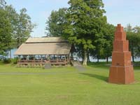
It's late summer, so a trip to the BLOCK AND HEXTER VACATION CENTER in Poyntelle, PA came around on my calendar. My teaching schedule allowed me to alternate sessions with fellow presenter Saul Silas Fahti, as we worked to expand the artistic, musical, polititcal, and in Saul's case, even cosmological horizons of the elders who flocked to the Poconos to participate, learn, and (it's a Jewish camp!) eat 3 squares a day. Whether singing, lecturing, or engaging in issues, I always learn from interactions with program participants. One highlight this year was meeting two Hungarian-born sisters who offered me a macaronic (mixed language) song that alternates lines between Hungarian and German/Yiddish. Will it make the cut on my upcoming recording? Stay tuned!
______________________

A quick trip to MADISON, WISCONSIN as part of "A Bisele KlezKamp" on July 22 was a terrific bright spot in a busy summer season! Over 200 people buzzed around programming by some of the best teacher/artists in the Yiddish folk arts world as Michael Wex, Cookie Segelstein, Lauren Brody, Henry Sapoznik, Sherry Mayrent, Miriam Isaacs, David Spies, Sara Gordon, Kurt Bjorling, Steve Weintraub, and I managed to compress a week's worth of learning into one fabulous day. Keep up-to-date with U. OF WISCONSIN'S MAYRENT CENTER to find out what Yiddish programming will be offered throughout the year before our triumphant return next summer!

On Friday night prior to 'ABKK' I was hosted by Congregation Shaarei Shomayim where I presented an a cappella lecture/recital titled "Healing the World in Yiddish Song." Given the political upheavals and charged emotions in Madison these days, the program was a welcome one. The room was packed with people of all ages, and it was a special joy to me to be singing in a room within Frank Lloyd Wright's historic Unitarian Church, where the congregation meets regularly.
_______________________

Lauren Brody and I head to PITTSBURGH on June 3 for two concerts, a family event in the morning, and a full concert in the late afternoon at the JCC, in conjunction with the Jewish Museum's exhibit on the artists who illustrated the works of I.B. Singer. We're working up new material and are delighted that both PennPAT and the PA Humanities Council are supporting the program with generous grants. Come celebrate Yiddish culture!
__________________________
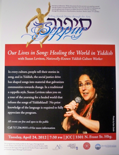
Healing the World in Yiddish - This lecture/recital program drew people from a wide variety of backgrounds and ages to a program sponsored but DICKINSON COLLEGE, the Literary Heritage Fund, Association for Jewish Studies, and the Jewish Federation of Greater Harrisburg on April 24. With PowerPoint translations and even a visit from Dan Kahn and the Painted Bird on screen, we explored the drive for human rights that infuses Yiddish song, and the activism that the songs inspire. As part of a series titled "Telling Jewish Stories through the Arts," the evening's riches were obvious as participants lingered over tea and cake and shared the stories that bubbled up in response to the presentation. What a great night!
_______________________
________________________
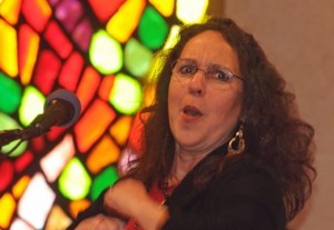
On Sunday, April 1, the Jewish Federation of Greater DAYTON and the Lynda A. Cohen Yiddish Club welcomed Lauren Brody and me for a concert. It was the first time that Lauren and I had the opportunity to present a full concert and we felt like siblings on the stage, finding parallel expressions of meaning and intention in her accordion and my voice without even a nod or a word. Utilizing the full range of her instrument, Lauren crafted a unique setting for each song, and the 'whole cloth' was fantastic.
We're already warming up for an upcoming event in June, so stay tuned for details!!
_____________________________
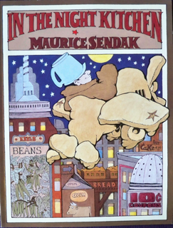
MAURICE SENDAK! I write this on the day of Maurice Sendak's passing. (If you haven't heard both the recent Fresh Air interview and the hilarious pair of Colbert interviews with the incomparable Mr. Sendak, go find them NOW and come back here in an hour...) I am grateful and humbled to have had the opportunity to spend several months immersed in the life and work of Mr. Sendak, preparing for a program built around the Rosenbach's exhibit of the influences of his Jewish world on his life's work. So on Sunday, April 15, the Haverford Public Library swelled with the sounds of Klezmer as I took over the children's wing of the library to present "Yiddish in the Nutshell" with Ken Ulansey on clarinet and Heath Allen on keyboard. Sendak's early life in a Yiddish-speaking immigrant neighborhood in Brooklyn, the awareness of evil in the world, and the fears and bravery of children shaped much of his life's work, and I blended his personal life into songs and stories for a rollicking hour. The program was interactive, with sing-alongs, props, costumes, and wild Sendakian tales abounding. It was a Yiddishe Vilde 'Rumpus' for everyone's inner child! Pick up a book by Maurice Sendak and look deeply into it. You may be changed!
________________________

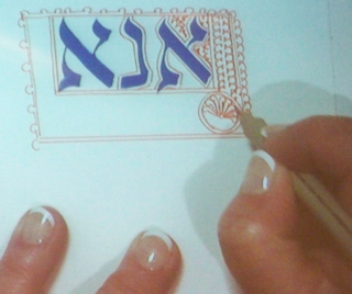
LAFAYETTE COLLEGE Hillel hosted me on Tuesday night, March 20 for a program in song and story on the actual history of the Sarajevo Hagaddah. It was a real one-woman show as I demonstrated design, lettering, and gilding techniques of the centuries-old masterpiece, as well as recounted its improbable story interspersed with songs in the Sarajevo dialect of Judeo-Spanish, in Yiddish, and in Hebrew, along with a Moroccan chant - all related to the Hagaddah. The audience included students, college faculty, and local residents, and there was a lively Q and A at the conclusion of the program. Lafayette has a gorgeous old campus perched above the city of Easton at the confluence of the Delaware and Raritan rivers. I hope to return!
__________________________
LAUREN BRODY will join me in presenting a full concert in Dayton, Ohio on Sunday, April 1 for the annual event honoring the memory of Lynda A. Cohen. We are thrilled to have the opportunity to share the stage and have been working up two terrific sets for the Yiddish club and expected gathered throngs!

_______________________________
A presentation of my concert "Women's Voices in Yiddish Song" at Penn State University in Middletown, PA on February 23 drew people from Lancaster, York, Lebanon, and the greater Harrisburg area. Having been interviewed for an upcoming article in a Dayton, Ohio paper the night before, I kept thinking during the concert of a particular question I was asked: "What do you want people to take away from your performance?" So I'll tell you: I want people to be so surprised and touched that they come away with a desire to dig a little deeper into Yiddish culture and discover something about themselves. The values and history that are packed into our songs go far in teaching us how to know ourselves if we just open our hearts a bit. That's why I sing. Oh, and also, I sing because I can't NOT sing!!

Only a week to go before Kerhonkson, NY becomes the temporary capital of Yiddishland! This year at KlezKamp I'll be teaching the hands-on papercutting course and a four-session a capella lecture/recital course.
I'm especially looking forward to the time I'll be carving out with fellow PennPAT artist SUSAN WATTS to work on some vocal duets and arrangements, and to begin taking concrete steps towards my NEW RECORDING, which will be produced by the amazing MICHAEL WINOGRAD! Check this website regularly for announcements, too, of a new duo in the works featuring MICHAEL WEX and Susan Leviton. Use your imagination for now - details to follow soon!
_________________________
![]() On Sunday, November 20, 2011, I presented a "Conversation with the Artist" in conjunction with the "Making it Better: Folk Art in Pennsylvania Today" exhibit in which one of my papercuts is featured. I demonstrated the art of Jewish papercutting and shared insights into its history and contemporary expressions with about 30 museum-goers. On exhibit through April 29, 2012, Making It Better tells the stories of over 30 master artists whose works represent a wide array of traditions such as African dance, stone wall construction, Native American clay flutes, Pysanky eggs, contemporary blacksmith work, woodcarving, and Vietnamese funerary portraits. I'm honored to have been chosen to have my work represented among so many brilliant examples of folk arts.
On Sunday, November 20, 2011, I presented a "Conversation with the Artist" in conjunction with the "Making it Better: Folk Art in Pennsylvania Today" exhibit in which one of my papercuts is featured. I demonstrated the art of Jewish papercutting and shared insights into its history and contemporary expressions with about 30 museum-goers. On exhibit through April 29, 2012, Making It Better tells the stories of over 30 master artists whose works represent a wide array of traditions such as African dance, stone wall construction, Native American clay flutes, Pysanky eggs, contemporary blacksmith work, woodcarving, and Vietnamese funerary portraits. I'm honored to have been chosen to have my work represented among so many brilliant examples of folk arts.
_________________________
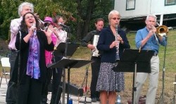
Groundbreaking for Chisuk Emuna Congregation's new synagogue took place in Harrisburg on Sunday, October 16, 2011, and over 350 people celebrated with a block party that featured kugel in a sukkah, carnival food, games and abundant crafts for children, and an afternoon of outstanding music: klezmer, jazz, and old-timey. Bands set up on a concrete pad at one end of the soon-to-be-a-shul property, and music filled the air! I had the pleasure of singing once again with the Old World Folk Band, which has recently welcomed several new musicians as regulars, and which added additional guest performers for the outdoor event.
The synagogue was destroyed by an accidental fire in 2009, and more recently was left homeless when The Flood of 2011 forced the congregation from temporary quarters in the JCC. The sense that the next plague was waiting in the wings was banished by the wonderful welcome to a new neighbrhood, and it looks like the block party may become an annual event!
___________________
A whirlwind few days at the 14th annual IAYC (International Association of Yiddish Clubs) conference in Novi, Michigan offered me the opportunity to perform and teach, and to meet people from all over the country who gathered to celebrate Yiddish culture. Highlights for me were presenting my powerful lecure/recital, "Rage Against the Sewing Machine" in this 100th anniversary year following the Triangle Fire, and joining Dan Kahn on the bandstand following my solo concert.
To see parts of one of my programs at the conference, please visit www.yiddishlives.com/susanleviton
_

