Gifts of May Day Ketubah
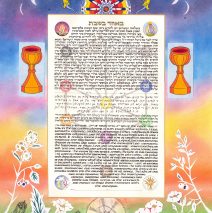
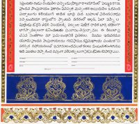
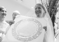
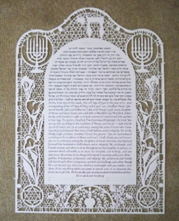
What an experience it was to work with an exciting pair of musician/circus performer/activists who decided with great joy to bring their closest friends and families together for a rollicking May Day wedding on a Texas ranch! As you can see, the design is a complex melding of traditions and conscious inclusion of the spiritual touchstones of their lives. First of all, this is a ketubah in FOUR languages: Aramaic, Yiddish, Modern Hebrew, and English, each expressing an aspect of commitment in a lettering style that suits the culture and meaning. The texts float above a representation of the Kabbalistic tree, and in the four corners of the text block are images that recall the significance of the date of the wedding – a Beltane fire, a Maypole, an image for International Workers’ Day, and a sheaf of wheat for the period of the Omer. Above the text is an antique circus wagon wheel, and below, over a tree trunk base, is a schematic drawing of the gear mechanism of a carousel! Turnings and turnings! Papercut herbs and flowers towards the bottom are interspersed with imaginary flowers, and references to the Tarot and the phases of the moon complete the design. The star-sprinkled sky is also embellished by tiny Swarovski crystals, difficult to see in a photograph, but dazzling on the actual ketubah. Our first Skype conversation yielded 4 pages of notes, and to my delight I was given extremely specific imagery to track down, including the Latin names of the papercut flora! I must say, I lived very happily in the magical and spiritual land of this ketubah for a few...
Read MoreNature’s Colors Papercut Award
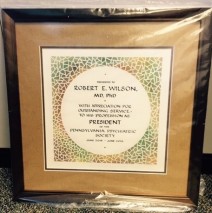
Each year I am fortunate to be commissioned to create honorary awards for the PA Psychiatric Society, and I begin the process by inquiring about the recipient. In this case, the recipient is a distance cyclist, among other interests. I chose the papercut scheme after learning about some of those interests, and chose a palette of colors that one might see on a long-distance bike...
Read MoreTorah Wimple – The River out of Eden
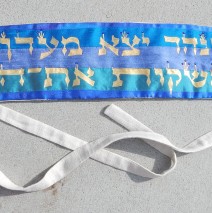
This Torah Wimple (binder) was commissioned as a gift from a rabbinic school class to the chapel at the school upon ordination. The passage from the book of Genesis, transliterated as “V’nahar yotzei meyeyden l’hashkot et hagan,” means “And a river went out of Eden to water the garden.” The wimple is crafted of colorful silks, quilted and embellished, with a backing and ties designed for ease of function and to grip the klaf (parchment) without sliding down, because, after all, this is a piece of ritual art which must do its job! The text is created with textile paint, and further embellished with Swarovski crystals in the place of the tiny tagin (crowns) that appear in the Torah text. Torah...
Read MoreSycamore through the Seasons Quaker Document
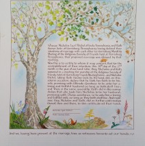
One precious tradition in the Quaker community is to have all attendees at a wedding sign the marriage document as witnesses, so the design is begun with that in mind. The lines for witness signatures continue far below what’s seen here, and upon completion, I’ll take the document back and erase the very light lines. Here the couple chose to work with the image of the sycamore tree in its four seasons arching over the text with the lines for witnesses (who will sign in brown ink) below, implying the roots and support for the marriage. The text is nested within nature images, the wildflowers at the base of the tree echoing the seasonal changes in the tree’s crown....
Read MorePapercut Ring Marriage Document
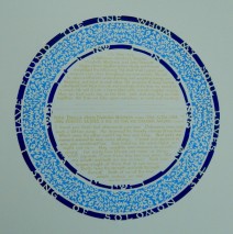
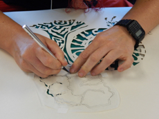
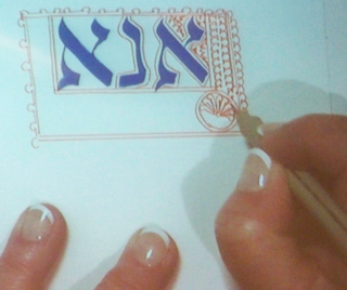
As always, surprises come my way when couples talk with me about their ‘wish list’ for a custom commission. In this case, the text includes Latin by Petrarch and Dante, and a lovely selection from the poetry of Christina Rossetti. The challenge of the poem was that in verse it breaks into many lines with lots of punctuation. Placing that in a format that more resembles prose and needs to keep the integrity of the poetry while showing line breaks was a challenge, so the solution was to cut the tiniest circles out of the paper and back them with a lighter paper to minimize the disruption that inserting more symbols would have caused. The Latin text is lettered in an authentic Rustic style that would have been seen in Latin scribal work at the time of the original writing. Calligraphic history and integrity! Note in the close ups below that the lettering is done in gold! This is a high quality (Schminke) gold gouache, a pasty water-based paint that may be thinned enough to flow through a pen. Oh, and the papercut? I used about a dozen X-acto blades on this. The tiny points break, and the friction when cutting heavy paper dulls the blades as well. I purchase my blades in bulk! Work in...
Read More
