Intersections Between the Columns Ketubah
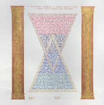
It cannot be more satisfying for an artist embarking on a custom commission than to have people be clear in their vision! This couple not only imagined the shape of their requested text, but also gave m specific colors and even textures! If you look carefully, you’ll see the movement of colors, but you may not recognize right way that the borders of the two triangles themselves are different colors! I mixed gold and copper paints to achieve this look. Those two metallics are also seen in the columns, where the paint was thickened to create a deep texture. The metallic colors and the columns? The wedding took place in a synagogue with soaring gold and copper touches, and the colors of the text itself echo the color scheme of the sanctuary tapestries! What allows the text to appear with such sharp lines defining the shapes is that each letter that spans a ‘line’ is written with multiple colors, splitting the letter to clarify the division of the sections!...
Read MoreMountains and the Night Sky Ketubah
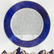
I never lose excitement over the visions that people can express when we sit down to discuss a custom ketubah! This one is at once intricate and minimalist. The sky features two specific constellations set into a luscious blue and purple swirl of the heavens – my idea of a Hubble Telescope shot! And the mountains. They are clearly stylized, exactly what the couple requested. These are two lovers of the outdoors and I am delighted to have been chosen to represent their ideas on paper!
Read MorePeacock Pair in the Pomegranate Tree Ketubah
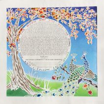
There was magic afoot when I was able to share the tradition of the goldene pave (the golden peacock), as a symbol of Yiddish culture after learning how deeply connected the bride felt to her own tradition’s veneration of the beauty of the same bird. The three of us worked closely on every aspect of the papercut design you see above in order to bring their desire for a vivid setting of their words to life. Tucked into the center of the document is the Sanskrit, translated into English and circling the...
Read MoreWhere There is Love Marriage Document
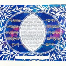
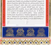
A marriage that honors the traditions of Judaism and Greek culture led this couple to incorporate both Greek and Hebrew in the design of this elaborate papercut document. The line, “Where there is love, there is life” appears in the text and has been pulled out to create the design on either side of the text lozenge. Surrounded by papercut olive branches and a traditional key pattern, the text is centered and floats above a painted background that simulates deep space and the imagery with which we have become familiar by way of the Hubble satellite and others. Color was most important to the bride and groom, and touches of gold sparkle through the piece. The entire work is cut from one sheet of white paper with the Greek and Hebrew words painted gold on the...
Read MoreIsraeli Wildflowers Glass Mosaic
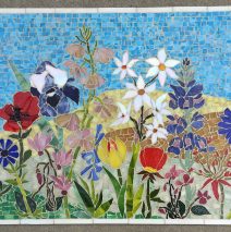
Branching out into glass mosaic is a natural extension of the glass work I’ve done as wall art in the past. This 16″ X 20″ piece is all hand cut and mounted, with one glass fusion poppy. The artwork represents endangered wildflowers of Israel. The piece is finished in glass on the sides and is ready to hang. Inquire about...
Read MoreWhite on White Lattice Ketubah
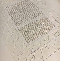
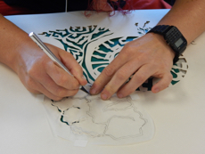
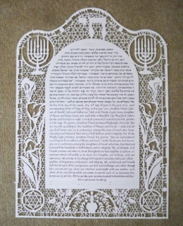
While papercutting is a largely universal folk art form, and while Jewish tradition has a rich history of ritual papercuts, the shifting of this craft into 21st Century Jewish expression is extraordinary in its appeal. Based on the clarity of this couple, decisions about the colors, shapes, and overall treatment of the ketubah came together very quickly. The entire piece is hand-cut from a very sturdy water color paper (which reminded my throughout the cutting that it used to be a tree!), and the background paper is just slightly more off-white, creating the most subtle contrast. Contrast is more strongly enhanced by raising up the front paper from the back paper by cutting the thinnest slivers of acid-free board and gluing them to the ‘struts’ to elevate the cut surface! The intentional drawing of the eye towards the text is done by subtly cutting the inner rectangle’s lines just a hair thinner than those on the outside, and making the spaces just a bit smaller. The intention is not to call attention to this, but to bring the eye to the text in the most natural...
Read More
