Engravers’ Arts Certificate
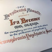
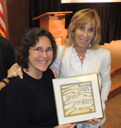
In the tradition of 19th and early 20th Century engraved certificates, I created this piece to honor the service of a leader in his field. The palette includes greys, navy blues, rust red and a more pale red/brown, and also a hand-mixed iridescent copper gouache. (Gouache is a thick, water-based paint that may be used either with brushes or dip pens. Tiny additions of gold leaf complete the...
Read MoreWindows of Color Ketubah
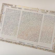
Most of my work is just a joy, and once in a while, the joy comes even before I have the germ of a visual idea! In this case I was blessed to be asked to create my first ‘second generation’ ketubah! I’d created the marriage contract for the bride’s parents … a while ago! Starting with a phone conversation and the most simple thumbnail sketch, we knew we were on the right path. The couple saw my sketch of 3 balanced but different-sized rectangles looking like windows into their new life. It was a GREAT idea that became our touchstone going forward. The central text is the traditional Aramaic language, and on either side a text that was written by bride and groom in English and translated into Modern Hebrew. I often ask people to take a field trip to a paint or hardware store and pull paint chips for me to match. This is one of the more magical things I get to do as I stir in a touch or this or that, mostly by instinct, to match the chips. This design called for colors spanning the three rectangles in a spray of arcs. It may look simple, but this required eight color arcs to move from a central point off the right side and allow the edges of the colors to read naturally. Wherever you can picture a ‘line’ between colors, the individual letters are drawn with my pen in two different colors, coming down exactly where the colors should meet! Good, sharp pen nibs and magnifying lenses over my glasses are among my tools of choice....
Read MoreNew York City Skywatchers’ Ketubah
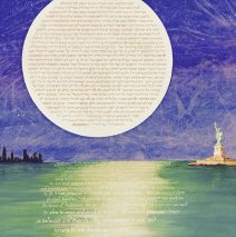
Deep sky, its swirling and wispy clouds reveal tiny pricks of starlight and a massive rising moon. You may imagine correctly that both bride and groom are deeply connected to New York and love to look beyond the lights of the city to the skies. The moon is mounted on a reverse-beveled board so it floats in the blue/purple heavens. What’s impossible to see in this photo is the deeply stippled background of lunar craters under the grey lettering! So take a look at the moon-in-progress: Another thing that’s hard to see in the photo is the detail on the skyscrapers, each showing the tiniest bits of light in windows. About 6 different pen nibs were used to write the English text since each line of lettering is very slightly larger than the one preceding it. (Star Wars...
Read MoreBlue Ridge Mountains Marriage Contract
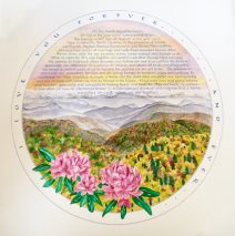
The precious couple who asked me to craft their marriage document told me that the Blue Ridge Mountains of North Carolina is their ‘happy place.’ When I asked for pictures, I did not expect MILLIONS OF TREES! Oh my. So I dipped into the wonderland of autumn color by creating a background painting of the sunrise sky and then the faintest of the old, worn mountains at the horizon, moving slowly, slowly forward into more sharply focused images. The trick to watercolor is to build up with great patience, keeping transparency as long as possible. A special aspect of this piece (and please suspend disbelief here, because there are two opposing seasons in one painting) is that the groom has a beloved daughter from a previous marriage. Their desire to represent their new family of three at the time of their wedding led us to come up with an iconic cluster of blooming rhododendrons in the foreground. They told me that when they received the piece and showed it to their daughter, she pointed to the small flower in the center and said, “That’s me, right?” Perfect!...
Read MorePets, Pittsburgh and Petrified Wood!
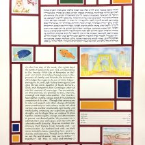
When a seemingly disparate list of images comes my way, I dive into the challenge of building an aesthetic whole. This couple brought me a list that included beloved pets (a cat and two fish), an iconic bridge, a cross-section of the Grand Canyon, petrified wood, and cherry blossoms. The color palette is bold, and together we came up with a riff on Mondrian’s recognizable horizontal and vertical blocks to define an appropriate space for everything: texts, signatures, and images. No matter where we begin our exploration, the final product is a reflection of the couple. I see my function largely as one who channels a couple’s vision, and there’s great joy in that...
Read MoreDelicate Seasons Papercut Ketubah
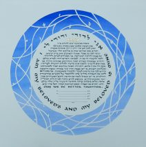
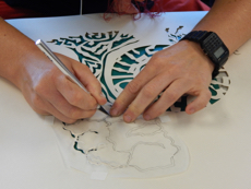
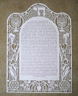
The simplicity of this ketubah belies the complexity of the couples’ intentions and the work involved in bringing their vision to life. We began with a request for leafy images of the turning of the season and a very simple papercut design. After many sketches sent back and forth, we hit upon a design that nests the text in a pattern of abstracted twigs. The seasons are referenced in tiny buds, opening blossoms, new leaves, and finally aging and falling leaves – only a few for each season. It’s worth the effort to spot the seasons this way! The background color took 5 different tubes of paint to mix in order to match the periwinkle blue paint chip that the couple chose. The background was painted on a stretched sheet of watercolor paper and then the text and papercut image were dropped on top to allow the cut paper to sit a bit...
Read More
