Soft Colors of Jerusalem Ketubah
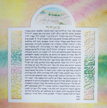
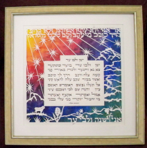
This couple had few but very specific requests: a traditional text laid out with squared margins, a painting of the Kotel (Western Wall) in a lunette at the top, water-like abstract papercuts bracketing the text, and a background of the soft colors for which Jerusalem is known. To emphasize the papercuts, I had my framer meticulously cut a backing mat with reversed bevels to elevate the lettered panel just a bit above the background painting while remaining invisible. Then to pull the eye into the text itself, in discussion with the couple, we decided to prepare mats for the wedding that were the choice for the final framing. The two outer mats were one four-ply and one eight-ply mat, the same color, cut to give great depth to the whole piece and keep the focus on the central area. Very effective! The wonder of watercolor is that working with transparent paint, you can build up multiple layers of subtle color to develop a depth unattainable with opaque paints. The paper must be stretched on a board to keep it from warping terribly with all the soaking the multiple layers create. Soft Colors of Jerusalem Soft Colors of...
Read MoreVivid Papercut Ketubah
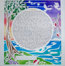
The exuberance of this couple is reflected in their concise wish-list for their ketubah: “Bright! A circular text with papercuts and a tree and two doves and… whatever you think! Bright and colorful!” We talked to flesh out some more specifics, but basically I was guided by a feeling of their energy and relationship. So here’s the finished product, which brought them to tears and had them each ask me how I had climbed into their minds to craft exactly what they’d hoped for!
Read MoreCalla Lily Papercut Ketubah
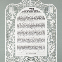
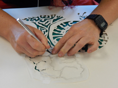
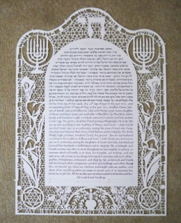
The bride and groom approached me with a desire to develop an elaborate and meaningful papercut design for their ketubah, and with just that much information and their short list of images – calla lilies, menorah, chai, a tree of life symbol, their Hebrew names, and a passage from Song of Songs – I set to work! I chose a domed shape for the text and a curved top to the entire piece to soften the look, as well as to connect to some historic ketubot, and tapped some traditional patterns from Arabic tilework as the lacy network to hold the papercut together. Hours and hours of cutting, and about two dozen blades left me with a happily tingling forefinger and a carpet of confetti! The couple chose to frame the ketubah by first mounting it on museum grade (non-reflective) Plexiglas, for the ceremony, that will eventually give the impression that the papercut ketubah is floating above the backing mat once the framing is complete. The lettering around the perimeter reads, “Ani l’dodi v’dodi li” in Hebrew across the top, and the English translation, “I am my beloved’s and my beloved is mine,” wrapping around the bottom. On either side are the bride and groom’s names in Hebrew. The engineering challenge in crafting a papercut is to make sure everything stays attached, so particular care is taken to plan connections before a knife touches the paper. Calla Lily Papercut Ketubah ...
Read MoreMatisse-Inspired Cutout Ketubah
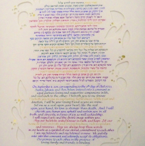
Simple cutout leaves and berries inspired by the work of Henri Matisse provides a setting for this jewel-tone ketubah. The ketubah was constructed in a way that elevates it above the background, the same color waterpaper with some of the ‘berries’ backed with gold leaf. The design is subtle and elegant.
Read MoreYehuda HaLevi Poem
This poem by Yehuda HaLevi was commissioned by parents knowing it is their son’s favorite poem. It was commissioned as a graduation gift. I studied several printed versions of the poem, each laid out slightly differently, and then contacted professor Max Tiktin to help me go through the words line by line to parse the meaning and determine the best way for the words to be laid out on the page. This is papercut from one sheet and mounted over a watercolor background.
Read MoreFor Your Sake Papercut
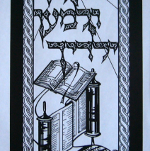
Commissioned by a Jewish dayschool as an award, the intricate design makes use of the most delicate lines to hold the papercut together. Notice the fine lines of the tsitsit and the tallit itself, and the rays of light from the ner tamid. Once I had the visual elements in mind, the challenge was to craft an overall pleasing design, so the long narrow image developed. I found the text in a museum exhibit of poster art from the time of early Israeli statehood. The particular poster that grabbed my attention was urging new immigrants to learn Hebrew. Notice the different ways in which the Hebrew and English letters remain attached within the artwork. As a papercut design, everything that appears black in the artwork (positive space, as this is the paper that remains while the rest is cut away) must be attached to other black paper or else it will fall away....
Read More
