Tri-lingual Ketubah – Hebrew English Telugu
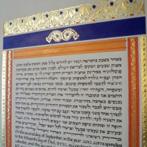
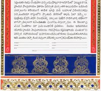
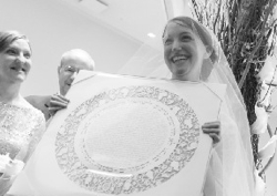
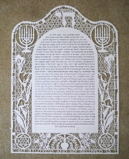
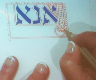
An extraordinary opportunity for me to learn came with a request to craft a marriage document (ketubah) in three languages: Modern Hebrew, English, and Telugu, a language spoken by the bride’s family in their home in south eastern India. Working closely with the rabbi/officiant, and then with a Hebrew translator and members of the bride’s family, we were able to acquire beautiful translations of the words that the bride and groom composed for their document. While I spend much of my life creating song and visual art that could easily have come from the late 19th century, for this piece I have been praising the internet to the heavens! The couple chose a palette limited to mango orange and cobalt blue, and the addition of gold leaf (many, many leaves, I can assure you!!!) allowed me to use those three color elements alone to craft the ‘long and narrow, simple and elegant image with paisley design.’ I sought out a small volume from the Victoria and Albert Museum on 19th Century shawl designs, heavily influenced by patterns from India, and with that, the aging hippie within took to the studio, happily! Can you imagine how many proofreaders I engaged? Notice below that the Telugu text is written with TWO different text weights. Written in monoline (which means no thicks and thins within the letters), I used two different Rapidograph pens to be certain that the writing was absolutely correct. ...
Read MoreHamsa Ketubah II
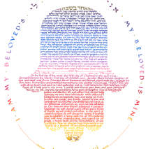
The bride and groom searched for a ketubah that would reflect their backgrounds and visions and found that I had crafted a text once before within the shape of a hamsa. The groom is Moroccan-born and speaks several languages, including French and Arabic. The Hebrew along with English and Arabic translations of a line from Shir HaShirim circle the text. The couple chose the colors they wanted to reflect a sunset atmosphere, and two tiny butterflies complete the design. Raised gold leaf dots highlight the design. The lettered art is created using gouache, an opaque, water-based paint, thinned to flow through a chisel-point...
Read MoreFour Seasons in Trees
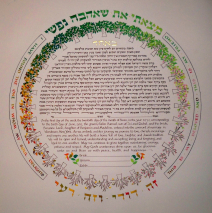
Inspired by a similar ketubah, this couple worked with me on developing a ketubah design that features 32 trees, each one slightly different from the one before and after, the foliage, berries, buds and blooms representing a discreet moment in the course of the year. A few judiciously placed, raised dots of 22 K gold add the sparkle that make the piece come alive. The lettered verses across the top and bottom translate as “I have Found the One in Whom My Soul Delights” and “This is my Beloved and This is My...
Read MoreSoft Colors of Jerusalem Ketubah
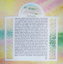
This couple had few but very specific requests: a traditional text laid out with squared margins, a painting of the Kotel (Western Wall) in a lunette at the top, water-like abstract papercuts bracketing the text, and a background of the soft colors for which Jerusalem is known. To emphasize the papercuts, I had my framer meticulously cut a backing mat with reversed bevels to elevate the lettered panel just a bit above the background painting while remaining invisible. Then to pull the eye into the text itself, in discussion with the couple, we decided to prepare mats for the wedding that were the choice for the final framing. The two outer mats were one four-ply and one eight-ply mat, the same color, cut to give great depth to the whole piece and keep the focus on the central area. Very effective! The wonder of watercolor is that working with transparent paint, you can build up multiple layers of subtle color to develop a depth unattainable with opaque paints. The paper must be stretched on a board to keep it from warping terribly with all the soaking the multiple layers create. Soft Colors of Jerusalem Soft Colors of...
Read MoreQueen of the Jews Book Cover
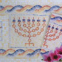
The opportunity to research and develop a book cover and maps for a work of historic fiction by author Judy Petsonk was one at which I leaped! An evocative work that paints in words images of ancient Judea prior the first Century also deserved cover art that would draw people into another time and place. This is the story of Queen Salome Alexandra (Shalom Tsion), woven from fragments The History of the Jews by Josephus and bringing life of a woman who ruled a nation and oversaw tremendous development of infrastructure in her time. The mosaic design is based on recently uncovered floors in the area of Lod. What goes around … ends up on a book! I had the delight of collaborating with graphic designer Tammi Reid who found the perfect typeface and photo image of a blooming almond branch which I was able to incorporate onto the back cover of the book A great...
Read MoreA Biselle KlezKamp – Madison
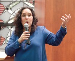
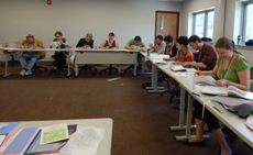
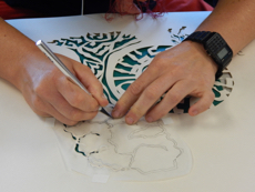
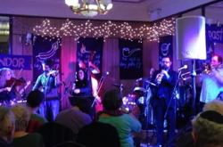
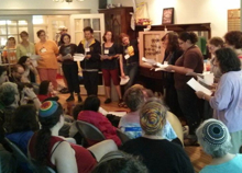
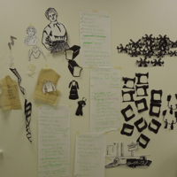
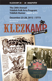
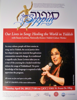
12 hours in Yiddishland! Make tracks to Madison, Wisconsin, July 22, 2012 for the celebratory birthday party of the Mayrent Institute at the University of Wisconsin. A full day of programming will include classes taught by Michael Wex, Henry Sapoznik, Miriam Isaacs, Sherry Mayrent, a spectacular faculty of musicians, and others. I will be teaching on traditional Jewish papercut art, presenting a lecture/recital, and performing with the KlezKamp faculty kapelye in the closing concert and dance party. Sarah Gordon will be running the KlezKids program throughout the day – and the entire program is FREE! Click here for more details. I will also be bringing a biselle Yiddish to Madison’s Congregation Shaarei Shamayim on Friday evening, July 20, at 7:30 with a taste of rare Yiddish songs and their powerful messages of healing the world, so add this to your calendar if Yiddish in the heartland is your...
Read More
