Cityscape Ketubah
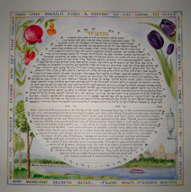
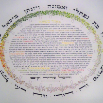
People often sit with me (or Skpye, or email, or otherwise connect) as we get to know one another and develop a ‘shopping list’ of what’s to go on the ketubah. Then it’s up to me to help them with a weeding process and take the final list and turn it into an aesthetic whole. This couple wanted their deep love for their hometown to be reflected in the ketubah, so pictures, postcards, and an extensive on-line search gave me enough material to place the two of them on the far shore of the river looking back at their city. The purple/black tulips and pomegranates reach towards one another at the top, and the text from Avot is lettered in the same colors as the city and river scene. It’s important when laying out text that wraps around a piece, as the circular ring of writing here from Shir HaShirim and the outer border lettering do, to be sure that the writing is legible without having to stand on one’s head to read it!! Thus the layout process involves more than even spacing. I always manipulate the words so they are not a distraction, but an enhancement of the overall design. ...
Read MorePeacock 50th Anniversary Ketubah
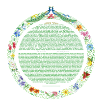
After 50 years, this couple chose to mark their anniversary with a beautiful ketubah. The ring of naturalistic spring wildflowers and the very specific spring green used for lettering the text captured their joy at finding themselves at this wondrous milestone. Peacocks are an obvious symbol of beauty in many parts of the world, but within Yiddish culture di goldene pave (the golden peacock) stretches beyond that as a literary symbol of the perpetuation of the culture. The peacocks that flank the top of the ketubah ring are flecked with gold leaf as a nod towards that part of our...
Read MorePapercut Roses
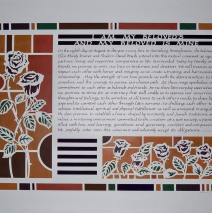
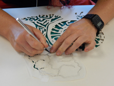
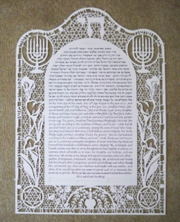
Entering into a second marriage, this couple was interested in acknowledging their new blended family and chose to represent themselves and their five children with one papercut rose each. The non-traditional, all English text of this document indicates a direction that some people are taking when dipping into a two thousand year old formula and finding a personal voice. Papercut art has a long history in the Jewish world, and this use of an Arts and Crafts architectural format and color palette in a meaningful Jewish document is in perfect keeping with the way in which ketubah art has always offered a snapshot of Jewish life set in time and place. After the design of such a papercut work, the most painstaking part of the execution is in fitting the color behind the piece. With only thin lines separating segments, the painted colors must be cut and set in on the back of the work with meticulous care. I work with a wide range of lettering styles (referred to as ‘hands’) in both Hebrew and English. This had is a modernized form of Carolingian English lettering, which seems to work well with the overall...
Read MoreKetubah of the Cosmos
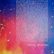
About-to-be world travelers and visionary activists, this couple had a very clear ‘look’ in mind, but left the details to me. The background painting was built up with multiple washes of watercolor until the saturation of color was deep enough to hold the white lettering. Gold leaf applied to a splattering of gesso added just the right touch to the depth of rich color. This is really a very simple piece but spectacular because it is vivid and deep. The watercolor was ‘worked’ on the surface while wet to create unusual textures and...
Read MoreStar Ketubah
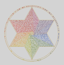
A precious piece of jewelry at bride’s late grandmother had given her became the inspiration for ketubah. It is simple silver star with each six segments slightly raised on edge to catch light. The effect something like pinwheel. Because the couple wanted spectrum of color, decided to divide the star into twelve segments more subtle color changes. Then the issue of math raised it head. After engaging my spouse’s number skills and watch pages fill with formulas to answer the question about fitting the text exactly into the star shape, I decided to tackle it myself. I wrote out the entire text, and then cut it up into sections and shifted the pieces around until I had a star filled with snippets of text. That gave me the dimension of star and the letter height and spacing using. This ketubah was one ever crafted in total silence. No books on tape, no favorite music, no nothin’! These changes around the spectrum often split individual letters into two, and closer to center, even three different colors per letter, so I could leave nothing to chance. It took total concentration to move those words around the...
Read More
