Jewish/Korean document
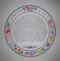
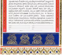
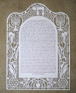
The two individuals who commissioned this document each have strong connections to their heritage and to their family’s roots. Thus a non-traditional marriage document was developed to honor the new intertwining of lives and customs. Though not a ketubah, the document is a witnessed contract of marriage, and highights the names of bride and groom in respective Korean and Hebrew. The symbols of a pair of ducks (who mate for life), cranes, and several of the specific flowers are all used in traditional Korean wedding ceremonies. I have been asked many times to make ‘ketubot’ for intermarried, and in some cases non-Jewish couples, and although I am always delighted to help people bring their visions (words and imagery) to life in a marriage contract, I am careful to explain that the term ketubah is a witnessed legal document of marriage between two Jews. As in all artistic life, the cross-pollination of cultures allows us today to bring that 2000-year old visual history into a new century and there’s no reason to restrict a healthy borrowing of styles and intentions. I just clarify that what we call a ketubah is true to the meaning of the term and that we appropriately honor the identities of the individuals who are marrying. It’s therefore very important that the language we use and the language within the document itself be as honest as it is celebratory. ...
Read MoreFrank Lloyd Wright-inspired Ketubah
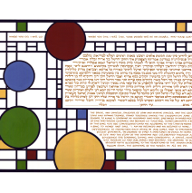
The couple who worked with me on this design loved the clean lines and visual balance of Frank Lloyd Wright’s geometric imagery. We determined that the overall shape would be horizontal, and examined several iconic Wright designs in order to identify just what grabbed them. I asked them to provide me with 4 or 5 color chips that would represent their palette and we were off! The biggest challenge was to fit the texts in Aramaic and English as well as the verse in the top section into sections of the design so they were fully integrated and balanced the colored circles and squares. An architect friend who saw the finished piece told me it was (til then, anyway!) her favorite among my calligraphic...
Read MoreHamsa Ketubah
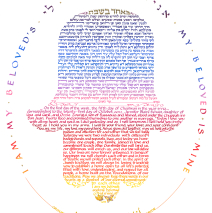
Sometimes the most elegant way to illuminate text is to allow the text to be the illumination! Quite simply, the text here is the design. (This technique has a name: calligram.) This couple wanted their ketubah to be rich with the colors of sunset and they found the Hamsa shape compelling. Quite an engineering feat! Tiny raised gold leaf dots add sparkle to the design, and the finished document incorporates the witnesses’ signatures both within the body of the lettered text (after the Aramaic) and to complete the outer oval (following the English text below.) There are so many small decisions to be made, and where to put the lines for signatures is an example of part of that process. ...
Read MoreElul Huppah Ketubah
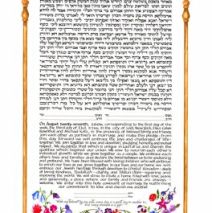
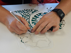
Creating this ketubah touched me deeply, as it was made for a dear friend who had been widowed. The English text of her first ketubah (which happened to be the first one I ever made) included an English line about the interwoven strands of the couple’s life. In celebrating this new love and life, I added an intricate papercut on the urn at the base – a mogen david comprised of intricately interwoven strands. The vessel itself is one that echoes the Tree of Life design seen in many cultures where green and flowering plants grow out of a container such as this one. The top of the huppah spells out the line from Song of Songs, “I am my beloved’s and my beloved is mine.” It is traditional that the initial letters of the four Hebrew words form an acronym for the month of Elul, most appropriate here as the wedding took place during that month. ...
Read MoreMacrame Ketubah
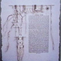
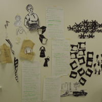
This intricate piece of fiber art tells a story! The ketubah was designed for a couple, each of whom had been married and had raised children before finding each other and beginning a whole new life together. The delicate macrame is crafted of perle cotton with tiny beads and mirrors worked in here and there. The story of the fiber art is that of their individual and then united paths: highly structured and tightly knotted at the beginning, then unraveling and leading to some ‘loose ends’, and then finally coming together is a beautiful new pattern, as yet unfinished, and leading off the paper edge. A tiny mirror worked into the design at the upper right reminds them to look inward and be true to themselves. The long twisting tassel on the far right is knotted as the tsitsit are knotted, to acknowledge their abiding connection to a Jewish life. Crafting a piece like this offers me many personal gifts: I come to know two people in ways I would not otherwise. The nature of this type of fiber art is that it is quite labor intensive and meditative, and so it allows me to hold the couple in mind as I make choices over and over about color, design and embellishment – it becomes an intentional piece of art as it evolves. And I have the opportunity to envision an artistic whole that involves more that two dimensions and is more than applying ink or paint to...
Read MoreCityscape Ketubah
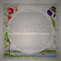
People often sit with me (or Skpye, or email, or otherwise connect) as we get to know one another and develop a ‘shopping list’ of what’s to go on the ketubah. Then it’s up to me to help them with a weeding process and take the final list and turn it into an aesthetic whole. This couple wanted their deep love for their hometown to be reflected in the ketubah, so pictures, postcards, and an extensive on-line search gave me enough material to place the two of them on the far shore of the river looking back at their city. The purple/black tulips and pomegranates reach towards one another at the top, and the text from Avot is lettered in the same colors as the city and river scene. It’s important when laying out text that wraps around a piece, as the circular ring of writing here from Shir HaShirim and the outer border lettering do, to be sure that the writing is legible without having to stand on one’s head to read it!! Thus the layout process involves more than even spacing. I always manipulate the words so they are not a distraction, but an enhancement of the overall design. ...
Read More
