Around the Seasons in Love Ketubah
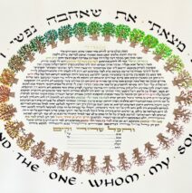
A couple reached out to me after seeing a ketubah I had crafted for dear friends many years ago. With a few tweaks and additions, together we created a new, personalized ketubah that sings with the seasons as the 32 trees represent a slight change in each of their crowns. Even in the most spare season, there are buds hiding! The movement is counter-clockwise to represent the left-to-right orientation of the Hebrew alef-beyt. As always, a joy to create in...
Read MoreIn Spite of Ourselves Ketubah
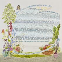
Well, if you know John Prine, you’re already laughing! When this couple contacted me, I could hardly write fast enough to capture their excitement about crafting a ketubah, and the chorus lyric from John Prine’s song was top of the list! Here’s a ketubah that’s built around a love of a particular part of the country with the blues of the text representing precious lakes for starters. Both people are organic gardeners and lovers of nature, so the specific list of requested images included a reference to bees (honeycomb design beneath part of the text), endangered butterflies, native spring flowers, and all kinds of vegetables – a farmers’ market in a basket. One particular request was mycelia! In order to represent life under the ground, I ‘planted’ a beet root that’s mostly in the dirt, and the little white mycelia and two friendly earthworms are a nod to the great underworld! If you haven’t heard the song, do look it...
Read MoreSunset on the Beach Ketubah
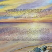
This couple had a most specific meaningful place in which they wanted the text of the ketubah to land. They sent me multiple pictures of the setting where they’d become engaged and that became the background. Choosing a color palette when lettered text goes on top of paint is always a challenge, and here the additional work involved planning the painting so there was appropriate space for the Hebrew and the English texts as well as the rocky shore the couple wanted represented. Watercolor is tricky and wants to be laid down in many many transparent layers to convey depth. I loved...
Read MoreAll This and Papercuts Too Ketubah
I love the experience of starting a ketubah with a list of imagery that sends me to do research and then tap my sense of balance and aesthetics so I can pull many ideas into a beautiful whole. This was the first time I’d been asked to paint a fox and a wolf, swans, doves, hummingbirds and harps on the same page! I especially didn’t want the carnivores to appear threatening to the birds, so I had to pose them looking away from the swans! Delicate papercut words are always a challenge because they must be legible and hold together. Corners. Oy! Everything has to read easily without leaving gaping holes. And letters like the Hebrew lamed present a design decision when part of the letter extends beyond the given space. All...
Read MoreFolkloric Papercut Ketubah
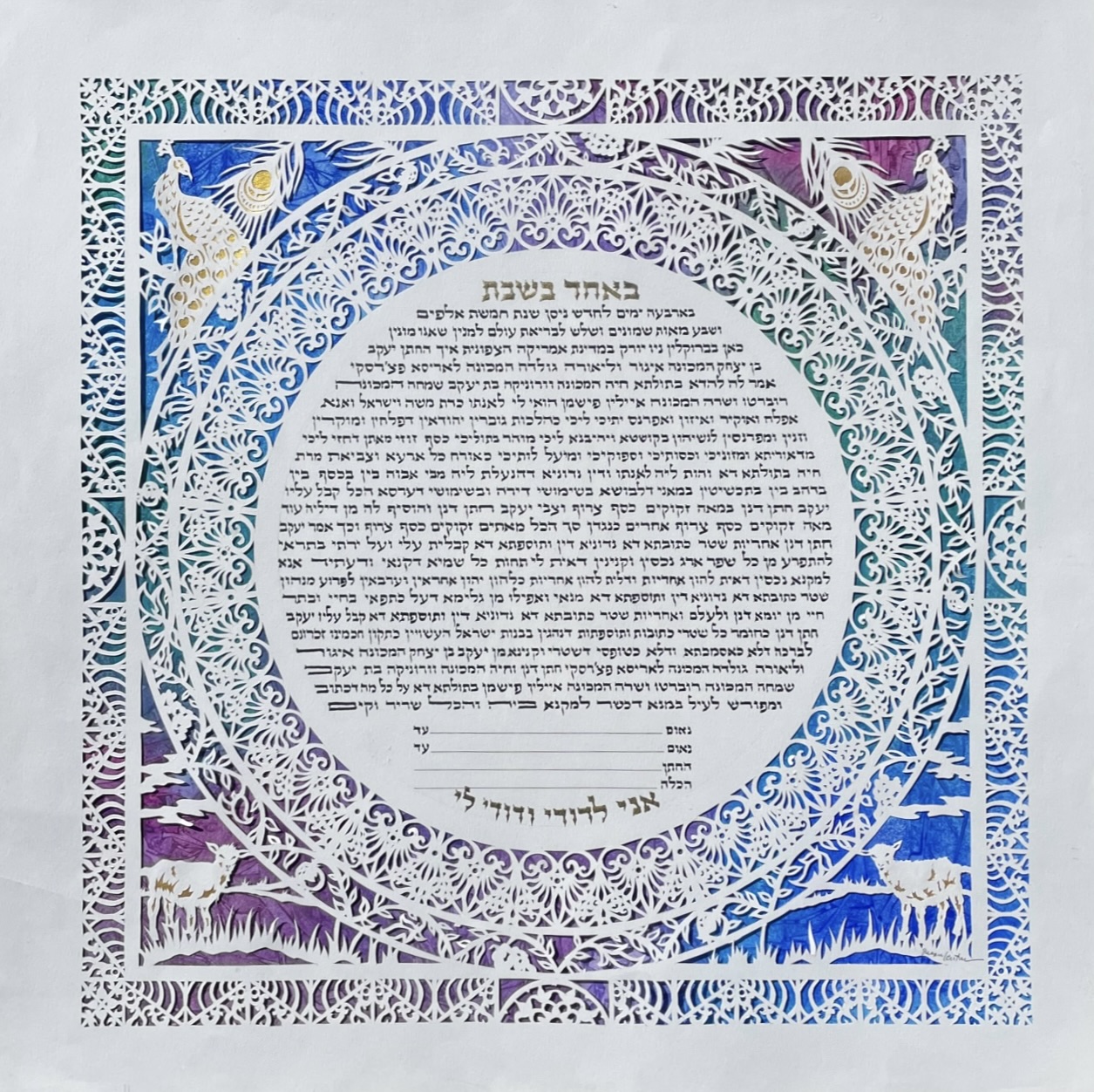
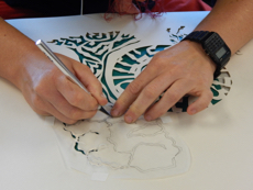
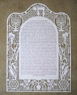
A very long time ago, I met a child who wanted to take my papercutting class at KlezKamp. And then quite recently I received a call asking if I’d craft a ketubah for this same person, and could I please incorporate some papirshnit! What a joy! As usual, the bride and groom and I exchanged many emails and eventually we settled on a few of the many and varied elements of their lives to become the framework of their ketubah. Images representing the histories of their families over many continents! – and their love of color, detail, and Yiddish folklore are all incorporated here. The heart-shaped inner ring around the text is a repeating design based on metal bridge railing in St. Petersburg, where the groom was born and grew up (until I met him!) The golden peacock (di goldene pave) and the white goat (di vayse tsigele) are both recurring images in Yiddish literature and folklore. Other designs represent fiber art that references the bride’s background. Even the colorful swirls below the intricate papercut were arrived at after careful back and forth discussion and the magic of our devices carrying preferences at blitz-post speed! There are lots of electronic tools to create lovely lettering and papercraft, but there’s something about the craeft itself that elevates work such as this because the human hand is as close to the surface of the art as it can be. What a joy to see that exposure to a folkart as a child has stayed vibrant and meaningful for all these years. I am ever grateful....
Read MoreBonfire at the Solstice Ketubah
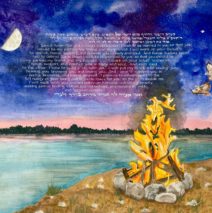
Every ketubah tells a story and some of them have spectacular plots! This couple exchanged vows on the Winter Solstice during the worst of the pandemic, and they commissioned a ketubah for a celebratory wedding months later. To capture the magic of the time they married, they requested a bonfire bringing light into the darkness, the moon in the exact phase of the solstice, the two hawks which appeared at the moment they stood at Lake Erie to exchange vows (!!), and the great conjunction of Jupiter and Saturn at that same time. Both deeply connected to music, they chose to have a personal reference to a particularly meaningful song. One of the joys of creating a ketubah ‘from scratch’ means that symbols and images may be worked into the design where only the couple can recognize them. A...
Read More
