Autumn Leaves Ketubah
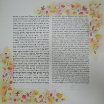
Soft fall coloring behind the tiny leaves of more than a dozen trees bracket the double text of this ketubah. As with each of my pieces, I try to capture the essence of what a couple tells me, and the research I do is part of the joy of...
Read MoreSeasons Papercut Ketubah
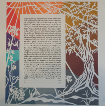
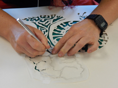
This design for this ketubah evolved very quickly once the couple found their words! Abstract, papercut, seasons, a connection to Israel, nature, and a very specific palette of colors! Finding the balance between the nature images they wanted and the request for abstraction was easy, since I explained that the nature of papercutting already creates a level of abstraction in the design. The link to Israel is the olive tree on the right, and the seasons are represented by both the imagery and the suggestions of color which the couple chose. The seasons move clockwise, so at the base of the olive tree (autumn) there’s a shift into winter. The first flower that appears is the snowdrop, a bloom that tends to pop up out of the snow in February. Spring flowers move the eye up into full summer, suggested by blazing color in the upper left. A cacophony of color was supplied via paint chips, and I spent one delightful day simply stirring colors to blend. Take a look at the palette prior to finding its way into a seasonal...
Read MoreRomanian Architecture Ketubah – Modern Hebrew, Yiddish, and English
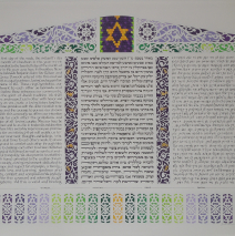
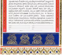
Fresh from their year’s work in Romania and Moldova, this couple chose to set their ketubah with papercuts inspired by architectural details of the clock tower of Sighisoura, rural woodwork, oh, and a design from the cover of an old piece of Yiddish sheet music! Musicians, cultural researchers… what a joy to collaborate with these folks! A trilingual ketubah: modern Hebrew, English, and Yiddish. This provided a challenge to get three texts of different lengths (the Yiddish – “an inefficient language,” their translator quipped, when that text turned out to be about 100 words longer than each of the other two!) to fit neatly into identical rectangles. (And nope, I use no computer to plot this out. It’s all eyes, a straight edge, and 10th grade geometry!) The rest of the wish list included specific architectural details, French horns and basses, and colors ranging from purples and greens to touches of yellow/orange. Here you see the result, and a few of the inspirations: ...
Read MoreFish Ketubah
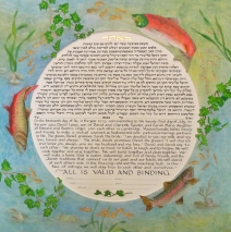
Oh, how I love commissions that send me to the library! The couple who requested this ketubah had a short list of specifics: salmon and trout in rotational symmetry, ivy, bilingual texts in a circle… with bits of the border design dipping into that circle. So I got to swim with the fishes! The painting is ‘glazed’ with 5 successive layers of transparent watercolor, leading to an illusion of depth as sunlight filters through water. The border painting was created separate from the text and mounted on acid-free mat board, allowing it to float above the text about 1/8″. It’s a marvelous look that creates another aspect of depth. A fine mist of mica flecks makes the surface of the border painting...
Read MoreTall Trees Ketubah
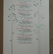
Simple, simple, simple, abstract, long and narrow, palette of warm greys, teal greens, and pinks. OK! As stripped down as this appears to be in contrast to other ketubot I’ve crafted, the ability to identify the minute details of what couples want is a necessary skill I bring to all my work. We were back and forth with many mock-ups, and after mixing up paints to match the paint chips the couple provided, we went through a ‘discovery period’ and finally settled on this image. The text is modern Hebrew, laid out in a ragged format (no justified margins) to interact with the abstracted leaves to the sides....
Read MoreFloral and Papercut Detail
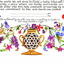
This detail of the bottom of a ketubah shows the clarity of my wildflower painting and highlights the use of a tiny papercut (probably an inch and a half in diameter) to provide additional visual interest. The intricate star shape is cut out of the full sheet of paper that forms the document, and it’s backed with a deep blue painted paper. The star is further enhanced with colored pencil shading that create and in and out weaving look. This type of container for greens or plants is one that is a universal image related to a tree of life, found in religious art throughout the...
Read More
