Seasons Papercut Ketubah
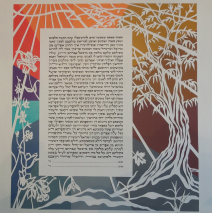
This design for this ketubah evolved very quickly once the couple found their words! Abstract, papercut, seasons, a connection to Israel, nature, and a very specific palette of colors! Finding the balance between the nature images they wanted and the request for abstraction was easy, since I explained that the nature of papercutting already creates a level of abstraction in the design. The link to Israel is the olive tree on the right, and the seasons are represented by both the imagery and the suggestions of color which the couple chose. The seasons move clockwise, so at the base of the olive tree (autumn) there’s a shift into winter. The first flower that appears is the snowdrop, a bloom that tends to pop up out of the snow in February. Spring flowers move the eye up into full summer, suggested by blazing color in the upper left. A cacophony of color was supplied via paint chips, and I spent one delightful day simply stirring colors to blend. Take a look at the palette prior to finding its way into a seasonal...
Read MoreRomanian Architecture Ketubah – Modern Hebrew, Yiddish, and English
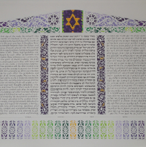
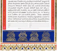
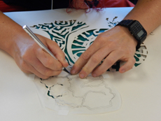
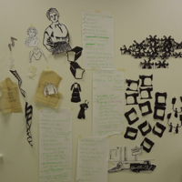
Fresh from their year’s work in Romania and Moldova, this couple chose to set their ketubah with papercuts inspired by architectural details of the clock tower of Sighisoura, rural woodwork, oh, and a design from the cover of an old piece of Yiddish sheet music! Musicians, cultural researchers… what a joy to collaborate with these folks! A trilingual ketubah: modern Hebrew, English, and Yiddish. This provided a challenge to get three texts of different lengths (the Yiddish – “an inefficient language,” their translator quipped, when that text turned out to be about 100 words longer than each of the other two!) to fit neatly into identical rectangles. (And nope, I use no computer to plot this out. It’s all eyes, a straight edge, and 10th grade geometry!) The rest of the wish list included specific architectural details, French horns and basses, and colors ranging from purples and greens to touches of yellow/orange. Here you see the result, and a few of the inspirations: ...
Read MoreCongregation Shaarei Shomayim, Madison
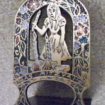
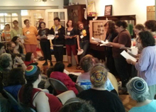
It’s with delight that I anticipate a return to a creative and welcoming Reconstructionist Congregation Shaarei Shomayim in Madison, Wisconsin on Friday, July 20, 2013 where I’ll be a guest lecturer for the Shabbat evening dinner. I’ll be lecturing that night on contemporary Judaica, with a look back as far as the 1950’s, and I will be sharing some outstanding images of creative and inspiring ritual art … and some of the best kitsch around, starting with my favorite right now: the 1963 Bas Mitzveh Zombie Bookend. Scared me then and scares me now! The congregation meets in the Frank Lloyd Wright Unitarian Church in Madison, and having just completed work on a new synagogue building in my own community, I relish the idea of examining that most thoughtful architectural...
Read MoreConcert – Chai Point, Milwaukee
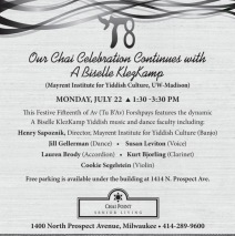
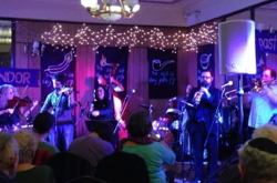
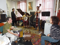
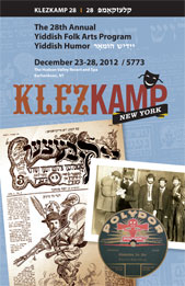
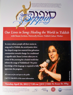
We’ll be flying high in Madison on Sunday, July 21, 2013 as the University of Wisconsin’s Mayrent Center hosts A Bisele KlezKamp, and the following morning, all-star performers Lauren Brody, Hank Sapoznik, Kurt Bjorling, Cookie Segelstein, and dance instructor Jill Gellerman will join me for a full concert with dancing at the Chai Point Senior Living Center in Milwaukee. It’s a rare and exciting gathering for which we have all been preparing for months. If you’re in the area, the concert’s at 1:30 pm at 1400 North Prospect Avenue in...
Read MoreFish Ketubah
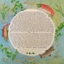
Oh, how I love commissions that send me to the library! The couple who requested this ketubah had a short list of specifics: salmon and trout in rotational symmetry, ivy, bilingual texts in a circle… with bits of the border design dipping into that circle. So I got to swim with the fishes! The painting is ‘glazed’ with 5 successive layers of transparent watercolor, leading to an illusion of depth as sunlight filters through water. The border painting was created separate from the text and mounted on acid-free mat board, allowing it to float above the text about 1/8″. It’s a marvelous look that creates another aspect of depth. A fine mist of mica flecks makes the surface of the border painting...
Read More
